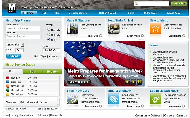
As promised, WMATA launched a redesigned web site today, accessible either from MetroOpensDoors.com or www.wmata.com. It’s certainly a step in the right direction as far as giving Metro the appearance of being a part of the 21st century goes, though for longtime Wmata.com users, it’ll take some getting used to.
While most of the changes are cosmetic, such as presenting Service Alerts in an easier to read, color-coded grid in the lower left corner, the rail map has been improved to include station addresses in pop-up windows that also give links to Google Maps, a feature that should make trip planning much more dynamic. Metrobus maps and timetables, unfortunately, continue to be offered in clunky PDFs.
We’re still testing out the user experience, so let us know what you think about how the redesign works for you as a Metro customer.