
 Noted graphic designer Ken Carbone used his space at Fast Company earlier this week to address the National Football League’s ugliest helmets, of which there are plenty. (Helloooooo, Tampa Bay!) As someone with an amateur hobby of monitoring professional and major collegiate sports uniforms — for instance: have you seen these new Nike college football unis, apparently left to us from a race of super-intelligent hypergalactic beings? — this editor believes Carbone hit a lot of the right notes. The best helmets in the NFL do belong to teams which have a natural symmetry in the logo (Eagles, Rams, Vikings), or teams who stick with classic, clean insignias and color schemes (Cowboys, Bengals, Browns — and although Carbone forgot them, the Packers).
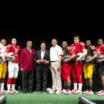
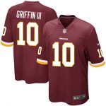
You’ll notice that the local football team did not make the cut of pretty designs. That’s because the Redskins helmet logo — although certainly possessing an iconic prestige — is kind of ugly, even for those who don’t find it culturally insensitive. For a team like the Redskins who have such classic uniforms and an awesome color palette (burgundy, gold and white is hard to beat), the helmet is a little bit dated.
All of this, I can agree with. But as far as Carbone’s feather-tastic “upgrade” (see above) goes, well, that’s another story. Some have called it “either beautiful or hideous.” (Feel free to mark me down for the latter camp.) What makes this design, unbalanced and far too busy for such a classic uniform set, an improvement over this design, which the Skins have recently worn as a throwback for anniversaries?
But what does the public think? Is Carbone on the right track or way off base? Let us know below and in the comments.
