 Photo by lonny.gomes
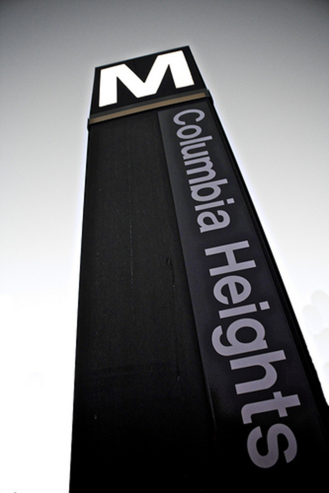
One designer who gave Metro its look thinks so, according to the Associated Press. What’s Metro’s major malfunction? Massimo Vignelli, who designed Metro’s distinctive pylons, says that the Metro system is too cluttered with signage.
At a panel yesterday, Vignelli — who also designed the breakthrough 1972 New York subway map — says that there is too much signage spread across Metro’s 86 stops. Vignelli collaborated with Metro’s architect, Harry Weese, to make a signage system that reflected Weese’s classical visual. Hence the Metro pylons, which also serve as air ducts and platform lights, as opposed to hanging or posted signs.
Since its inception, of course, Metro has added everything from issue ads to zoetropic moving picture ads to weird photoshopped numbers advertising Metro itself. Yet Vignelli’s beef appears to be with the redundant Metro signs announcing the names of the Metro stations. Those were added after riders complained that the vertical pylons, which read like book spines, didn’t read very well.
Nowadays, the pylons aren’t nearly the same locus for complaints. The pylons reveal at a glance which direction a rider needs to step off the platform to board the correct train. They’re easier to use than the signs posted across the tracks from the platform on the Metro tunnel wall, which are too often obscured by people — or trains.
“Designer dislikes additions” is a “dog bites man” kind of story. Not even the busiest Metro stations suffer anything like real visual pollution, and given how much hand-holding tourists require, redundant signage doesn’t quite pass muster as a design crisis. That said, a lot of Metro’s ad boards are kind of busted looking. Is there anything to do to update the 70s technicolor quality of those light boards?