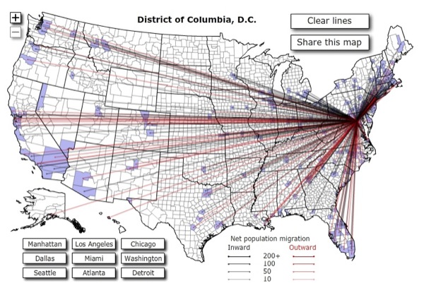
From this Forbes data visualization on county-to-county migration within the U.S., it would appear that in 2008, the District metro area was a net importer of northerners and a net exporter to the south. You may not be able to tell it from the image I downsized to fit the page, but look on the map proper and you will see a thin but unmistakable red ray — like a bright band on a coral snake — between the District and New York City. So this map doesn’t quite upend the conventional Brookland-to-Brooklyn trajectory.
From the looks of it, exiting District folk love New Orleans and San Francisco. Who can blame you/them! Below is the closest look possible at trends between D.C. and other Mid-Atlantic and East Coast cities. Quick: Someone come up with a social phenomenon these data prove!
UPDATE: What’s with all the D.C. people moving to Douglas County, Nebraska? Isn’t that just Laura Burhenn?