 Photo by sally henny penny.
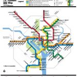
Last weekend, we tried to glean some hints about the redesigned Metrorail map from this Washington Post profile of Lance Wyman.
Wyman, of course, designed the original map more than 30 years ago and has been contracted by WMATA to update it. While Lyman was “reluctant to share his ideas for the new map” in the profile, he chatted with the Post earlier this week. Though he dodged several questions — about notating rush-hour stations, representing suburban services like MARC, and the possible integration of the Purple Line — he also let a few more hints fly about what might be in store.
- Those hoping for a true-to-scale Metro map might be out of luck. “The map is a guide for sequence and overall context of the system,” said Wyman. “It is more an index than a topographical map. The neighborhood maps give the topographical info.”
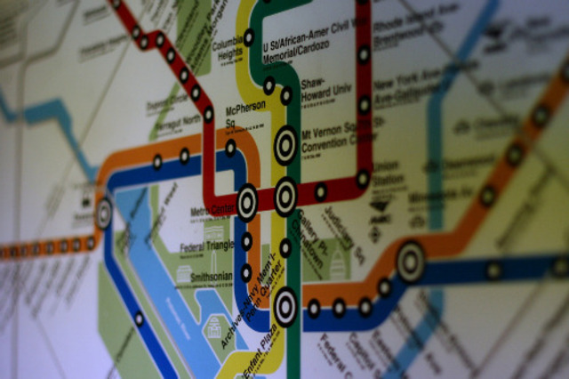
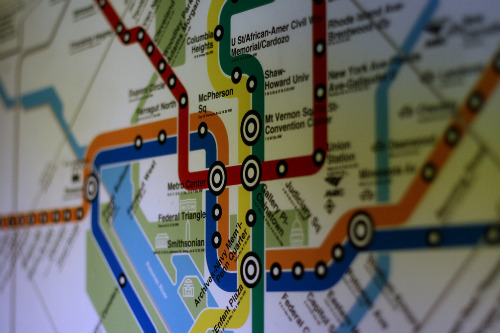
- The map’s iconic Helvetica font probably isn’t going anywhere: “Helvetica was mandated for the first map, it most likely will remain a part of the new map.”
- Colors — including possible changes in shade — have not yet been finalized. “The new Dulles line and additional services colors are key additions to the new map,” wrote Wyman. “What is important on the map should be clearly visible and how the colors effectively code and interact with each other is a big consideration.”
- The map will reflect Wyman’s trademark functional graphic design, but that’s no big surprise. “I would love to see station icons be a part…specifically – I have specialized in icon design and icon systems. Technology, especially personal computers, has helped us realize that icons, when designed and used properly, are great communication helpers when navigating the digital world. They can be an ‘everyones language’.”
- It appears as if Wyman will, as Metro has planned, integrate shorter station names in his redesign. “As the station names have gotten longer over the years they become much more difficult to understand at a glance. That doesn’t help,” wrote Wyman. But could station names be enhanced with iconography? “As was intended in the design of the original map 40 years ago, the thought of station icons as well as names could give you an immediate clue as to important aspects of a station…the names could be short, the visual icon would communicate everyone’s language. It would make the riding experience user friendly and help give a great city a visual index.”
- Finally, the map is something that will have to last. “If we can get another forty years out of it that will be great,” Wyman said.