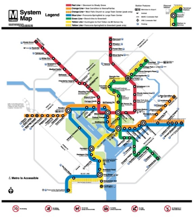

This morning, a first draft of Lance Wyman’s redesign of the iconic Metrorail map began to make the rounds. But it was missing one key aspect: a detailed depiction of the extension to Dulles International Airport.
It turns out that the transit agency and Wyman — who originally designed the Metro map — didn’t want to “clutter” this version of the map with individual stations and are still debating what color should be assigned to the Dulles extension. (As we noted in this morning’s roundup, Wyman prefers a “cool, pale pink” hue he’s dubbed “cherry blossom.”)
But as WMATA launched a rider survey to gauge public reaction to the first draft of the new map, the agency is being cautious, reminding riders that this is, after all, just a first step. In a chat with the Washington Post this morning, WMATA’s assistant general manager of customer service, communications and marketing Barbara Richardson dubbed the draft a “transitional map,” and noted that there will be major changes as the design process moves forward.
“The main objective of this map is to show the Blue/Yellow realignment before we begin Dulles service,” wrote Richardson. “As we get closer to the opening of the Dulles extension, there will be another map that depicts the new service.”
As Greater Greater Washington notes in, well, great detail, many aspects of the redesign followed a “sensible” path, including much-pined for shortened station names. There are a bevy of smaller details to soak in, like logos indicating parking and whether to indicate peak and off-peak Yellow and Orange Line service with dashes or lines — though those may very well change based on the results of the survey and with subsequent versions.
So, what do you think so far? Are Wyman and WMATA on the right track?

