Martin Austermuhle
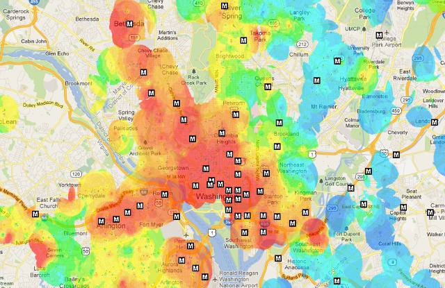

D.C.’s rental market is hot—and now there’s a map to help you see just how hot it is and where it’s hottest.
The folks over at We Love D.C. have created a map that indicates how expensive an area is by shading—red areas indicate higher rents (hot!), while green and blue give away the few remaining affordable places in the region. In those red areas, you can expect one-bedroom places to go for up to or more than $1,800, while in green areas you’d be in the $1,000 range and in blue you’d be below that.
No surprise here, but the majority of Northwest D.C. is solidly in the orange to red range, though there are pockets of affordability as you move north and east of 16th Street NW. East of the river and into Prince George’s County rents drop, while they remain relatively high in the Northern Virginia suburbs located along the Orange Line.