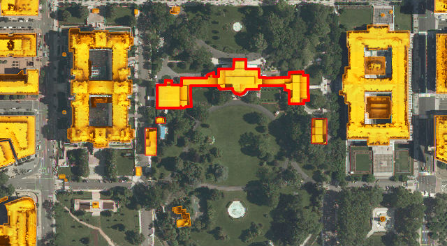
 The White House’s solar potential.
Have you ever wondered what the solar potential of your home is? Or where you work? Or the White House maybe?
A new interactive map commissioned by the District Department of the Environment and created by Mapdwell allows users to click on almost any building in the city and see “how much electricity can be produced on their rooftops from solar photovoltaic (PV) systems, how the financial investment will pay off, and how much pollution will be reduced.” You can also see where solar systems are already installed and what the yearly financial benefit is.
The data used to create the map comes from the Army’s Light Detection and Ranging (Lidar) system, aerial imagery from the D.C. Geographic Information System and building footprints from EarthData International, Inc. Mapdwell is “a collaborative effort by researchers, academics, and professionals at MIT.” Here’s a more specific description of how it works:
The tool uses high-resolution (one meter by one meter grid) LiDAR data (Light Detection and Ranging) to create a three-dimensional model of the sample terrain that accounts for the shape of building rooftops and structures, existing infrastructure, and tree foliage. The model is later used as the base for evaluating the amount of solar irradiation that falls on each unit of surface -for every single hour of a typical year- and determining its individual potential for solar electric generation using photovoltaic (PV) panels.
As part of the city’s Sustainable D.C. program, D.C. hopes to reach a 2.5 percent solar energy usage goal by 2023. The only other city in America with a Mapdwell solar system map is Cambridge, Mass.
Check out D.C.’s here.
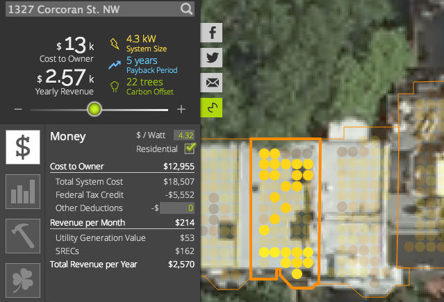 A randomly selected residential home.