
Via Curbed comes this interactive map from the MIT Media Lab’s You Are Here project that shows the fastest way to travel from one point in D.C. to another by using different modes of transportation.
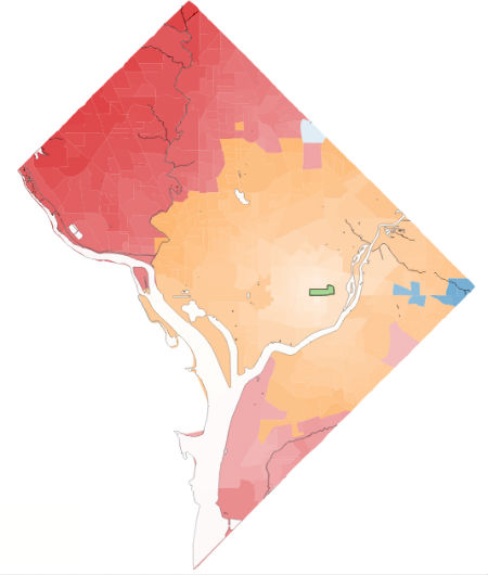 From Kingman Park, “0.1% of the city can be reached fastest by walking , 51.9% by bicycling , 1.3% by taking public transit , and 46.7% by driving.”
Locations that can be reached the fastest by walking are in green, while yellow represents biking, blue represents transit and red represents driving. Pictured to the right, for example, is the Kingman Park area. The map will also show you an approximate time to reach destinations around the city using that mode of transportation.
“Diverse modes of transit affect the efficiency of how a city works, and the reach of many of its citizens,” the You Are Here project writes of the map. “We hope that these maps help shed light on the the way accessibility shapes one’s experience of the city, and the need to plan our streets for multiple uses.”
To make this map, we gridded up the city at the block-group level, and then computed the time using each mode of transport from the centroid of the source block group to the centroid of the destination block group using the Google Maps API. For driving, we added a buffer time for parking and walking, and then we compared the four resulting times and colored the block-group based on the minimum.
A more complete calculation of transportation efficiency would not only take into consideration the time it takes, but the true cost of each mode of transport, including the cost of the vehicle, the cost of fuel, and the effect on air quality. In these calculations, walking and bicycling would cover even more area, and we will explore this in later maps.
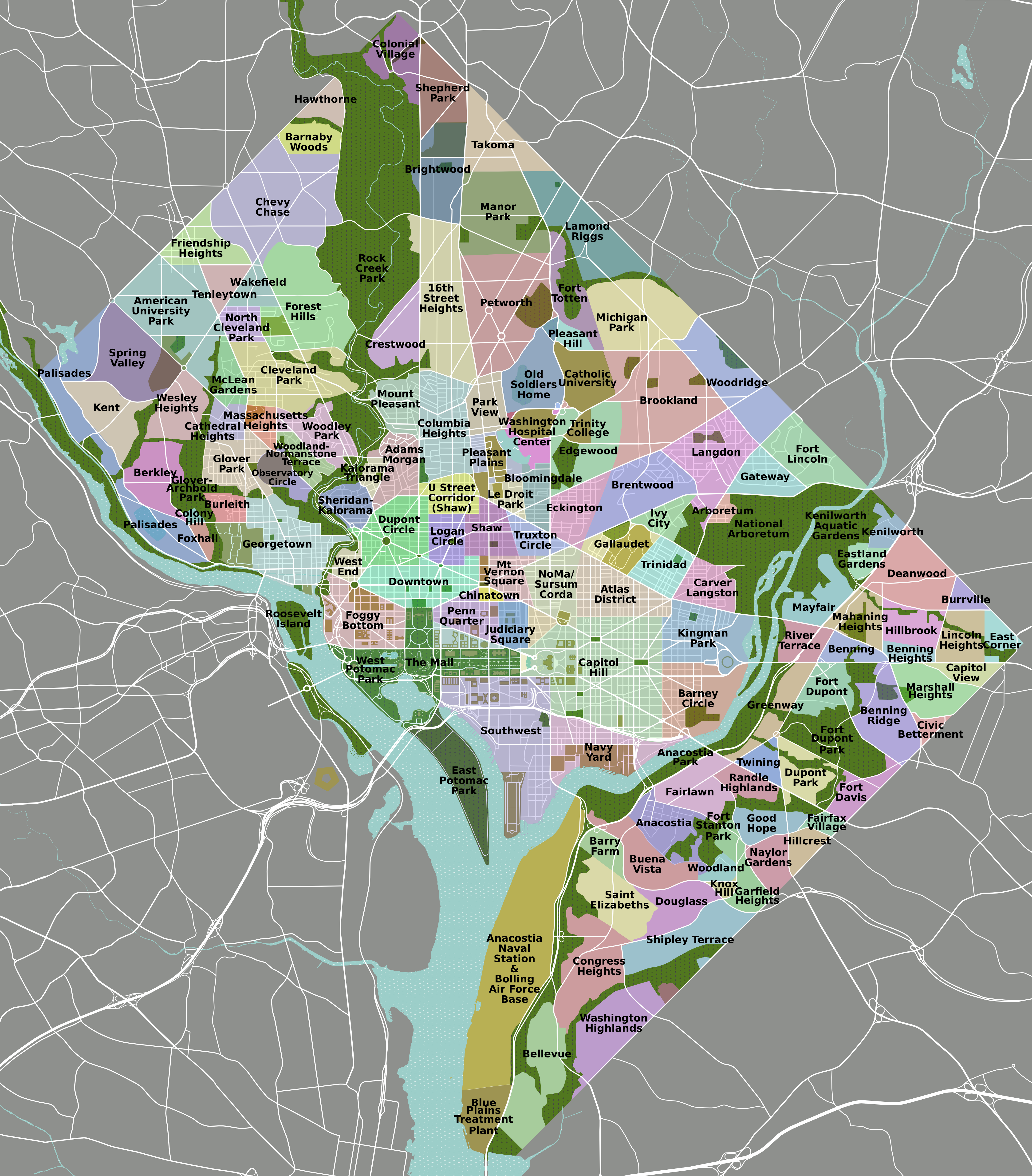
The names of the neighborhoods are not included, so brush up here.


