 Photo by Mr. T in DC
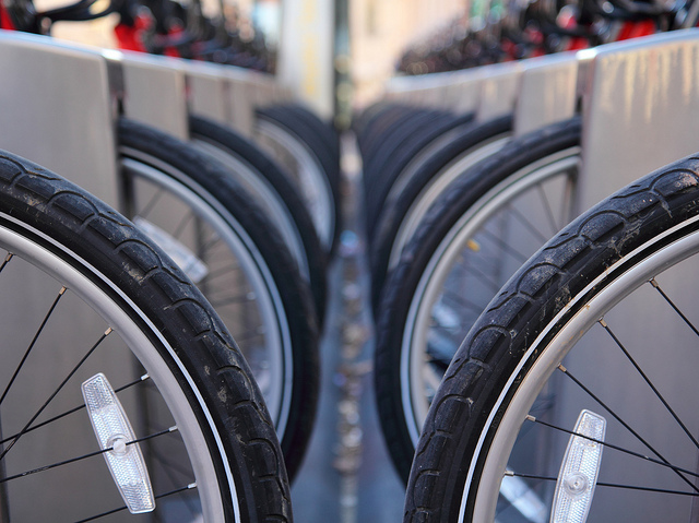
As the expansion of Capital Bikeshare continues, changing the way many Washingtonians commute around D.C., here’s another visualization from Mobility Lab’s Michael Schade, which shows how riders get to and from D.C.’s busiest transportation hub, Union Station.
Schade took data for all the trips to and from Union Station between July and September of this year, to put together this video. A little more than a week ago, Schade put together a similar visualization to show Bikeshare users’ trips, determining that the Lincoln Memorial dock is the most popular station.
As Schade writes on Mobility Lab, “because of Capital Bikeshare’s open data and visualizations like this that tell a story, we are learning how our city is transforming and can envision ways to continue making it an even better place to live.”