All Stories
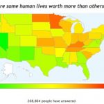
OKTrends, the official blog of social networking site OKCupid, posted some interesting color-coded maps the other day showing results from a recent survey they conducted – of, it should be noted, only their users, so it’s tough to say that’s it’s very scientific. Still, we got a kick out of the one at right, which purports to represent data on which parts of the country responded to the question, “Are some human lives worth…