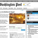
 A company called Eyetools Research has posted an interesting analysis of the Washington Post’s new website, concluding that although the design of the top part of the page is very good, the design of the bottom half could be improved: “ineffective line-height spacing and lack of white-space reduce reading. Most of the content is being missed and there is no consistent guidance of eyes to section headings.” The image is the company’s heatmap of the site showing where 19 new visitors to the webpage focused their eyes – view the complete image here (large file). (Ironically, the Eyetools blog itself is poorly designed!)
The Post also had an interesting online chat with Assistant Managing Editor for Continuous News Robert J. McCartney about how the paper manages their website. Cyberjournalist picked out some interesting bits, including this: “We decide whether to break news on the Web or in the newspaper depending on where we think it will have the most impact, and whether we think the scoop will ‘hold.'” He also commented he thought the shift from print to the web was “already taking place” at the Post, pointing out that because online advertising is taking off, “If that continues for a long period, it’s inevitable that The Post and other newspaper companies would devote more resources to the online medium.”


