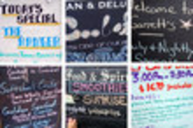
Our friends at Torontoist inspired an investigation of penmanship on daily menus. We call ours the M Street Manuscription. The boutique-happy boulevard running through Georgetown is big on daily menus, but who knows how daily they actually are? Judging by the faded quality of some letters, we suspect they might not be so du jour. More like tous les jours.
By aesthetic standards, the Rugby Cafe menu wins for appearing most like a children’s book. They get points for the illustrated sunrise and smoothie. Miss Saigon went a bit crazy on the dish detail — squinting from sunlight is one thing, but using a tiny font for cramming purposes isn’t cool. Miss Saigon and Garrett’s look a bit too similar, and so we’re skeptical about their originality. Dean and Deluca, you definitely used enough chalk. Coloring inside the letters too? Hey, how about that.
Let us know if there’s a budding artist out there whose handwriting font captivates you.
Clockwise from left to right from the top left: Booeymongers, Dean and Deluca, Garrett’s Restaurant, Paper Moon, Rugby Cafe, and Miss Saigon.


