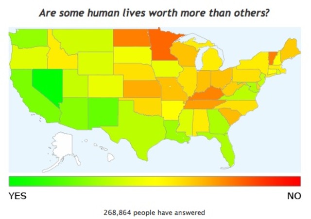
 OKTrends, the official blog of social networking site OKCupid, posted some interesting color-coded maps the other day showing results from a recent survey they conducted – of, it should be noted, only their users, so it’s tough to say that’s it’s very scientific. Still, we got a kick out of the one at right, which purports to represent data on which parts of the country responded to the question, “Are some human lives worth more than others?” on a scale of red to green, red showing more respondents who answered “
yesno,” and green being “noyes.” Here’s what they say:
This graph struck me right off because our map-making program is supposed to color the states from solid green to solid red, and there’s no true red on this map. This had Chris and I confused for a while until we realized: the true red is Washington D.C.; you can barely see the little dot there by Virginia. We’d forgotten that our Google Maps API plots D.C. as a separate data set. It’s the most ‘brotherhood of man’ place in America. Weird, huh?
We’re fond of reacting to most any survey that treats D.C. the same as all the other states by pointing out that, the District being an entirely urban jurisdiction, such data sets often mischaracterize how disproportionately liberal or urban or violent or whatever we appear to be. But it’s tough to say for sure that this is the case here. Do you think D.C. residents are really so much more accepting of all kinds of people than anywhere else in the country?