 Our friends over at Greater Greater Washington asked us if we’d point our readers to a little usability test they’ve created in an attempt to compare the old WMATA bus map with the new one. Metro apparently rolled out a new bus map recently without advertising it. Here’s what David Alpert says is different about it:
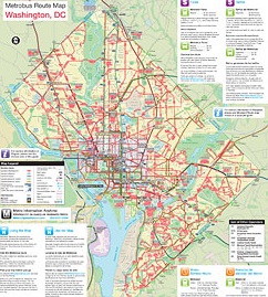
The biggest change is in the color coding of lines. Before, lines got one of several colors to distinguish them, though there were still several red line groups, several green groups, etc. Now, all lines that stay within DC are all red, lines entirely in Virginia purple, and lines that cross borders get different colors.
We’re curious to see the outcome of GGW’s test, which will only be more accurate with more data points, so if you have a minute and don’t mind downloading a .PDF file, click through and answer one simple map-reading question. GGW will post the results and their conclusions later on.