 Perhaps you saw this report from the Associated Press last week, which summarized WMATA’s proposed alterations to the way trains are routed through Northern Virginia in their attempt to alleviate congestion and begin preparations for service to Dulles International Airport. Here’s how the beef of that report read:
The change would reroute a third of blue line trains along the yellow line bridge, crossing the Potomac River and up to Greenbelt along the green line. Three trains also would be added each peak travel hour between West Falls Church and Largo Town Center to relieve crowding on the orange line.
Got it, frequent riders of the Blue, Orange and Green Lines?
The proposal [PDF], which was presented to WMATA’s board of directors last Thursday, is a prime example of how Metro’s communications with the bulk of its customers could really use some work.
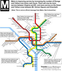
Friend of DCist David Alpert of Greater Greater Washington provides a much clearer breakdown of what this actually means for riders:
What Metro actually wants to do is to add a few rush hour Yellow and Orange Line trains and remove some Blue Line trains. Riders at Van Dorn Street, Franconia-Springfield, and Benning Road through Largo won’t have fewer trains; the new Yellow Line trains will go to Franconia-Springfield (and Greenbelt, actually adding service north of Mt. Vernon Square rush hours), and the new Orange Line trains will go to Largo.
Riders from Franconia and Van Dorn who go to Rosslyn, Foggy Bottom, and Farragut West, or transfer to the Orange Line, might have to wait longer for a train. However, it will give Franconia and Van Dorn riders a one-seat ride to Yellow Line stations, and provide more trains overall for everyone on the Orange Line in Virginia and the Yellow Line in DC and Maryland. Once the Silver Line opens, some of the Orange trains, including the new ones, will become Silver Line trains.
That’s quite a bit different than the AP report. Alpert kindly allowed us to use the map that he has made — independent of Metro — to help explain the Blue Line changes. (Here’s a larger version of the map.) WMATA’s presentation on the changes does include a pair of visual aids, but nothing that would really further the understanding of how this rerouting would charge most people’s commutes. (When we asked WMATA for clarification, they simply refered us back to the presentation.) One would think that something similar to Alpert’s map, included in a press release, might have helped avoid some confusion. Did WMATA think that the proposed changes were planned so far in advance that people didn’t need a map yet? Or were they just happy to allow anyone reading an Associated Press report to assume what these changes might practically mean for a large chunk of Metrorail riders without a visual representation?


