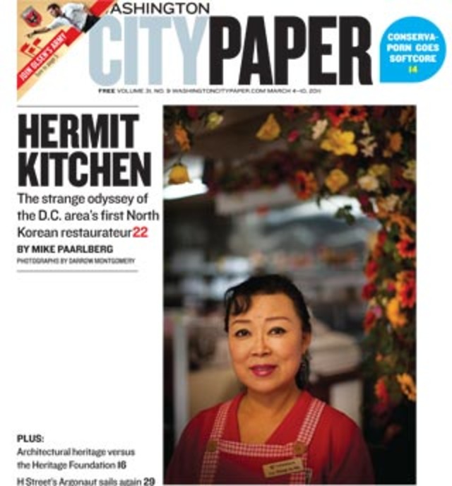
 The Washington City Paper unveiled a new logo in print and on the web this morning, shifting away from the brand it had used since 1996. The logo revamp is the most visible part of a cleaner look for the alt-weekly, which includes several changes inside the paper.
The City Paper’s print edition now contains a “Chatter” section, which will cultivate “the most interesting responses to City Paper reportage from snail mail, e-mail, Twitter, and around the Web.” Also, the paper’s “news” section has been rechristened with the paper’s “District Line” moniker, and there is a revamped event listing section. A comics section will also return to the paper starting next week. There are also plenty of nods to the publication’s long history, like the continued use of Monotype’s News Plantin font.
City Paper Creative Director Jandos Rothstein, who designed the old City Paper logo in the mid-’90s, notes in an essay that the new look will better reflect the paper’s content:
The paper on streets this week offers a more compact logo and a modular layout that will let us tell readers more—on the cover, and inside. The new design permits us to once again feature uncropped images by our brilliant staff photographer, Darrow Montgomery. And inside, smaller margins and signage gives us the room to provide more content and bigger pictures.
In this redesign, we’ve also done some visual untangling and reorganizing—for example, separating our comments section from the news spread. Overall, we hope it’s a bit less fussy, more urban, and able to do a better job showcasing City Paper’s provocative content.
City Paper staffers are out at Metro stations today, handing out the papers to readers in order to gauge reaction to the redesign — what do you guys think about the new look?

