The Washington Wizards unveiled a new logo and uniforms this morning, switching to a familiar red, white and blue motif and bringing back a font and logo which harkens back to the team’s glory days. The design brings all of Leonsis’ sporting interests — the Wizards, Capitals and Mystics — under the same patriotic theme.
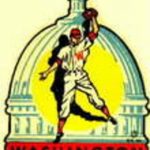
 Despite significant clamoring from fans to change the name of the team back to “Bullets,” the team was unable (or unwilling, depending on your viewpoint) to do so. Instead, the team’s new logo and jerseys are about as close as the team could get to that brand without actually changing its name. The team’s new “DC” logo even features the same “ball and hand” design that the Bullets logo had (see right). The team will wear white jerseys at home and red on the road. (A re-colored version of the team’s Wizard and crescent ball logo that had leaked in March is apparently part of the branding — it’s used in an advertisement on the Wizards website this morning.)
On his blog today, Wizards owner Ted Leonsis said that the team “tried to pay homage to the past and what you liked most about the traditional look” with the new design, while still giving the uniforms “a modern twist.”
“What we have done is simple and I think elegant,” wrote Leonsis. “The players like it very much and I hope you will too. … I also know that the jerseys and new look and feel will look much better if we can build a winning franchise.”
What do you think of the new logo and unis?