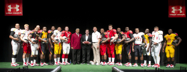

The University of Maryland showcased its brand new uniforms for their football program in a runway-style event at the Clarice Smith Performing Arts Center in College Park yesterday evening. Co-hosted by Under Armour, the outfitter for all of Maryland’s athletic teams, the Baltimore-based apparel company introduced a complete redesign of the football program’s jerseys for the first time since 2004.
Maryland athletic director Kevin Anderson kicked the night off by reiterating his commitment to spreading state pride with the administration’s focus on emphasizing Maryland, and the new uniforms were an extension of said goal.
With players strutting down the aisle in their new duds, boosters in attendance were introduced to 16 (yup, 16) combinations of jerseys, pants and helmets over the course of the evening. The jerseys and pants were unveiled in four varieties: red, white, black and gold — all colors that are prominently found on the Maryland state flag. The red and white tops featured gradient numbers, while the black and gold exhibited solid-color digits. Additionally, a subtle turtle shell design dubbed “Terraprint” is featured on all of the gear as well.
With “Maryland” visibly displayed on the front of the jersey, the player’s names on the back were nowhere to be found. That is because first year head coach Randy Edsall decided against the surnames in order to stir up team unity. Maybe Edsall has a little bit of Tim Gunn in him — the names would have made the uniforms even busier than what they already are.
As for the headgear, gone are the white helmets with the script “Terps” lettering. Instead, a thin stripe that features segments of the Maryland flag run from the front of the helmet to the back. There will be two helmets this season: the white helmet includes the “Terraprint” shell design, while the black goes the minimalist route with a matte finish.
Edsall said he would like to gather fan input on what combination the team should wear when they face the University of Miami on Labor Day evening.
As for this author’s opinion? The all-black combination is probably my favorite. It’s straightforward without all the distracting effects of the white/red tops. The black helmet was wonderfully executed — a simple yet effective design. Meanwhile, the white helmet, white jersey and gold pants combo comes in as a close runner-up. I’m not a fan of the gradients, but, hey the kids seem to love that sort of thing.
DCist wants to know: what’s your take on the new jerseys?