Martin Austermuhle
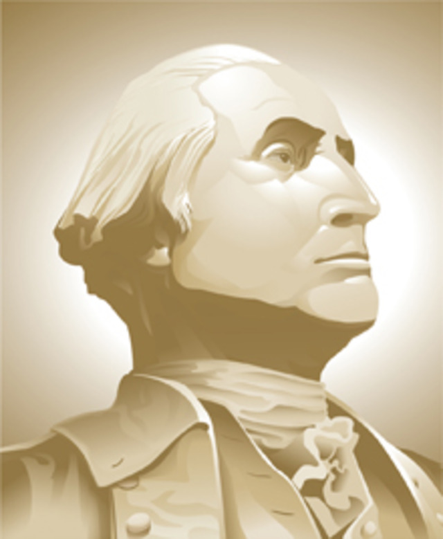
 These days, it isn’t so much what you say or do, but rather how you package and present it. For that, an entire industry of brand specialists has popped up, offering advice on how to tweak around the edges to make your product, service or political point more attractive to as many people as possible. Sometimes it works, and sometime you wonder why anyone would pay that much for something that’s not really all that different.
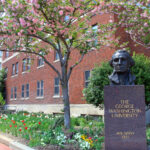
 Take the George Washington University, which yesterday unveiled—to great fanfare—a new “visual identity” that took two years worth of research, collaboration and design and the price of two consulting firms to produce:
“The visual identity we’re revealing today is so important because it’s one of the ways in which our story begins to be presented to the multiple audiences that reach us through our websites, through our flags, through our business cards, through everything we do across the university. So we have developed a new vocabulary, a new way of talking about the university, a new way of depicting the university visually that will present our story at least in its raw form,” said Dr. Knapp. “I’m impressed by the new vocabulary. I think it does a great job of connecting the vision that our founding imaginer, our originator George Washington had when he died in 1799 and left in his last will and testament a vision of a university that would educate citizen leaders on to the future. That vision is embodied in this new way of imagining the university, and it also connects us to our aspirations to become simply the most powerful and influential research university in one of the greatest cities in the world.”
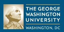
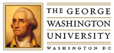
While the entire undertaking involves everything from messaging strategy to new websites, the most obvious change is in the university logo. The portrait of George Washington was redone—he’s now looking in a different direction!—and the university opted for a new font.
So how was the new look received? According to the GW Hatchet, with understandable skepticism:
“I don’t really find it that revolutionary,” said freshman Katie Cann, while another freshman attendee, Ellie Davis, said, “For the hype, it really isn’t worth it.”
A Hatchet poll of 122 individuals across campus showed dozens of students were largely uninterested in the logo redesign.
“They make sure a big fuss about this whole unveiling,” graduate student Jessica Hunt said. “It doesn’t look any different.”
Sophomore Jennifer Hamilton said her first reaction was to wonder how much the project cost.
“I would just really like to know how much of our tuition went into this process,” she said.
The university has refused to say how much it paid for the firms’ services.