From the Urban Institute comes a series of maps and visuals that show how Washington, D.C.’s demographics changed from 2000 to 2010.
Below, for example, are two maps from Our Changing City that show the difference in Millennial population (each light blue dot is a person between the ages of 18 and 34) from 2000 to 2010.
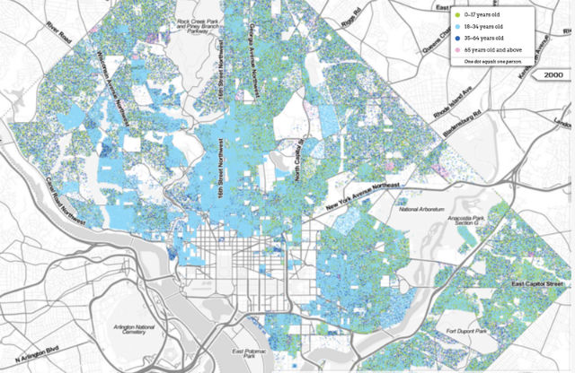 2000.
2000.
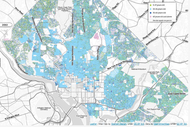 2010.
2010.
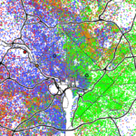
Another visual shows how D.C.’s black population shrank during the decade. The change from pink (with each dot representing one black person) to green (one white person) is very dramatic in parts of the Northeast.
Also mapped is the city’s density, and a look at the changes in Columbia Heights and Mt. Pleasant.
The project ends with a series of questions sure to dominate public discussion in the years to come.
Once-neglected neighborhoods, scarred by riots, are now recovering and even thriving—but revitalization can drive out long-time residents. How can we make sure they have the opportunity to stay and benefit from the city’s new prosperity? Millennials are reshaping DC, but will they remain as economic growth returns to other parts of the country? And can DC grow with them to meet their needs as they start having families and buying homes?
Figuring out how to manage and plan for change begins with determining our goals. If we want diverse neighborhoods and communities, we must consider what it really takes to get there.