Margaret Barthel
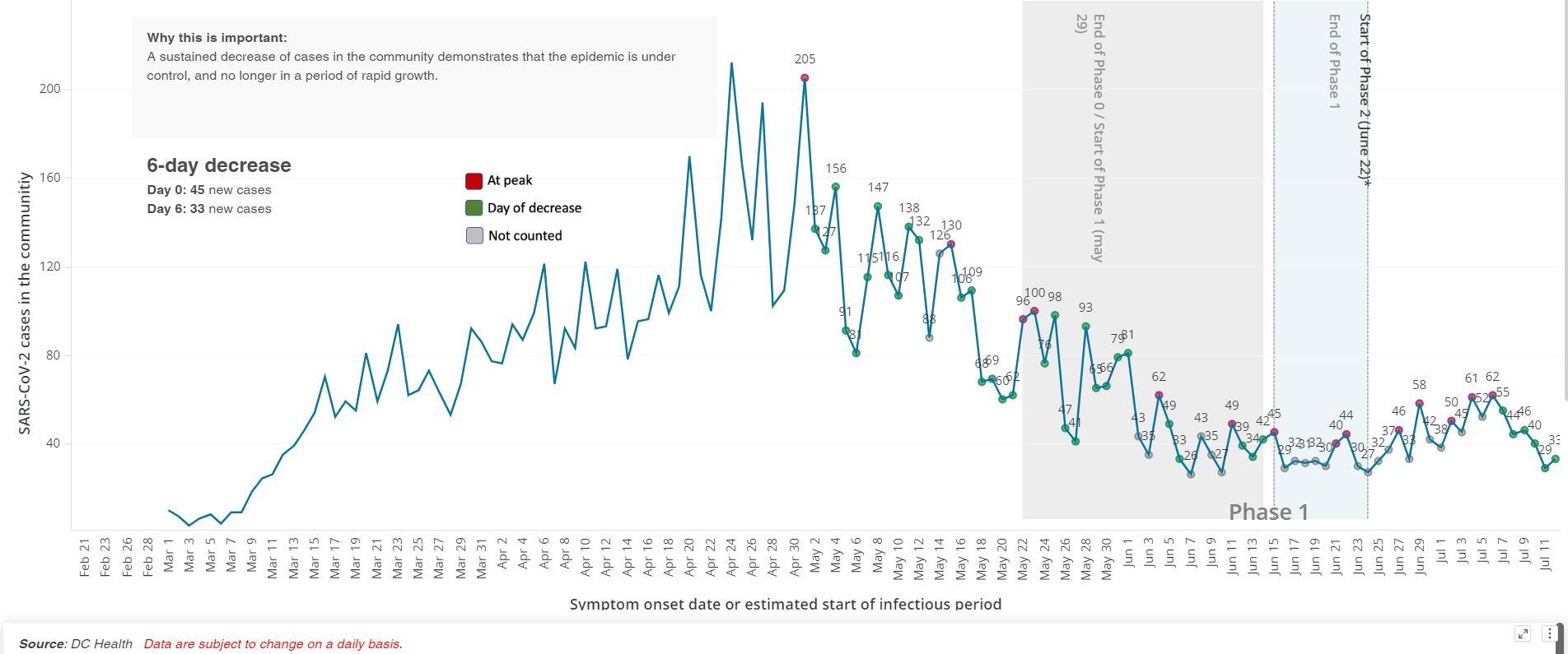
There’s a lot of public health data flying around these days — data that officials say is crucial to understanding the trajectory of the pandemic and the region’s reopening decisions.
But given factors like testing delays, lower-than-hoped-for contact tracing success, and increasing COVID cases across the region, it’s easy to wonder: What do those numbers all mean? And can I trust them to be accurate?
“I think what it comes down to is that data is one input to decisions about reopening, and it’s not the only input,” says Crystal Watson, a senior associate at the Johns Hopkins Center for Health Security and assistant professor in the university’s Department of Environmental Health and Engineering. “We have to know that it will be a driving input to these decisions so that they won’t be driven solely by politics or other considerations.”
WAMU/DCist collected some of your data questions. And with help from Watson, we tried to answer some of them — or at least provide some context.
How do D.C., Maryland, and Virginia compare to other jurisdictions nationally in terms of data quality and transparency?
All things considered, Watson says the region has done “a pretty good job at making data available and keeping it up to date and providing detail that a lot of other states are not.”
There have been instances in the course of the pandemic where different jurisdictions have been criticized for their data reporting practices. In May, the Richmond Times-Dispatch reported that Virginia’s COVID-19 testing numbers — an important reopening metric — were inflated because the commonwealth’s Department of Health was counting antibody tests and diagnostic tests in the same figure. Virginia has since stopped lumping the two different types of tests together.
Data on the spread of the coronavirus in long-term care facilities like nursing homes has been another flash point. Maryland was the first jurisdiction in the region to release a facility-by-facility breakdown, in April — but the state has since removed case and death counts from its totals after outbreaks subsided in individual facilities, meaning the numbers under-report the cumulative impact of the pandemic in nursing homes, the Baltimore Sun reported. Virginia resisted publishing facility-level information until last month, after the federal government started collecting the information. D.C. is providing similar information, but it’s hard to find, buried several tabs into its downloadable COVID-19 spreadsheet.
How do delays in people getting the results of their COVID-19 tests back affect the usefulness of data on the outbreak?
Despite efforts to significantly increase testing, it’s still taking more than a week in many cases for people in the region to get the results of their tests. Watson says that’s “a real problem.”
In an ideal world, Watson says, test results for a laboratory diagnostic test would be available in 24 hours. The longer the lag time in receiving them, the longer public health departments will wait to begin tracing a confirmed case’s contacts, who in the meantime might unknowingly spread the disease further.
“Ten days is a long way from that [24 hour period],” Watson told WAMU/DCist. “It’s really hard to make decisions from the public health perspective about what to do, where to provide resources, where we have these hotspots, because when we’re looking at the data, we’re really looking back in time at least a week.”
And, on an individual level, she notes, delays in testing mean people may struggle to make individual decisions about their own conduct — whether they should quarantine or if it’s okay to go out in public.
D.C. Mayor Muriel Bowser has pointed to national roadblocks in testing as one reason for the delays in results.
“We can collect samples. We’ve pretty much gotten that down. But we need the labs to complete the tests,” said Bowser at a recent press conference. “And these labs, largely, are national in scope. So, what they do in Delaware affects processing time for us here in D.C.”
Outside of the District, testing can be less available, especially for people who don’t have symptoms. That could distort the coronavirus numbers, though both Virginia and Maryland report relatively low percent positivity rates, a measure that indicates the proportion of people who test positive out of the total number of people tested. A lower percent positivity is thought to be a good barometer for how effectively a testing regimen is catching positive cases.
What data do we have about how contact tracing is going in the region?
Watson says she would especially like to see more information available about contact tracing efforts, especially as the region continues to reopen.
D.C. is currently publishing data on two contact tracing metrics: One is how many contacts of confirmed COVID-19 patients have been reached out to within two days of identifying them — in other words, how promptly attempts at contact tracing are occurring once a case is confirmed. That measure is currently above the 90% goal the District set for itself.
It’s worth noting that the D.C. data reflects attempts to contact people, and does not provide any information about whether the contact tracer had success in doing so. Maryland and Virginia offer more detail on that front.
In Maryland, the state Department of Health is also publicly tracking the promptness of its contact tracing attempts. The state’s data indicates that contact tracers are reaching out to 90% of cases within 24 hours of a case being entered into the system. The state is also providing information about how many cases ultimately complete an interview and provide information about their close contacts. Virginia measures how many cases and contacts have been successfully reached, represented as a 7-day rolling average.
D.C. is the only one of the three jurisdictions so far to publish “percentage of new cases from quarantined contacts” on its online tracker, measuring how many new cases are already-quarantined close contacts of a known case. (D.C. Health began doing so on Monday.) The District is currently at 3.1%, meaning that most of D.C.’s new cases are not people who were already being monitored because they were exposed to a known case. Ideally, officials want that number to be above 60%.
But it looks like it’ll take a long time to get there. Not only is the gulf between 3.1% and 60% large, a look at the metric over time shows it holding mostly steady over the past month, despite the District’s ramp-up in contact-tracing capacity.
Watson says that the measure tops her list of information she’d like to see collected more broadly, especially if the percentage is low.
“That’s an indicator to me that there’s a lot more spread going on that we know about,” she says. “And in that case, I certainly would take more precautions when going out to the community and doing things that might expose me.”
Could changes in federal reporting requirements for COVID-19 data affect what we see locally?
The Trump administration recently shifted federal COVID-19 data reporting requirements, getting rid of the CDC as a recipient of the information in favor of a federal contractor and state health departments. Watson said it’s too early to tell how the change might affect the information available on the local and state level. But she’ll be watching, she says, to see if the new federal reporting structure still aggregates and shares information back to states.
“It needs to come back to them in some form so they can make decisions themselves. It shouldn’t just be for the federal government for their decision making,” she says. An important thing the CDC does, she says, “is to aggregate data and provide information and help states make their own decisions.”
What is “community spread” again? And how does it fit into area reopening plans?
Across the region, public health departments measure the spread of the virus by looking at whether the number of positive cases from day to day is going up or down. Most jurisdictions say they want to see 14 days of declining new case numbers — what D.C. refers to as “sustained decrease in cases in the community” — before moving into a new phase of reopening. Essentially, the idea is to measure which direction the arrow is going: Are more people getting sick or are fewer people getting sick? (Note, regardless of which direction the arrow is going, there are still people getting sick.)
D.C. measures “sustained decrease in cases in the community,” or “community spread,” by counting “days of decrease.” A “day of decrease” is when the number of new cases is “less than 2 standard deviations from the 5-day rolling average from the previous low; or there are NOT three days of consecutive increase.”
That’s different from other jurisdictions, which are using rolling averages to calculate days of decrease. Virginia’s dashboard, for instance, shows a 7-day rolling average.
Montgomery County compares each data point to the one two weeks prior: “A declining day occurs when fewer cases/deaths/hospitalizations/patients/tests are reported at the end of a 14 day period compared to the number at the beginning of the period, using a 3-day rolling average,” a method it says is a recommended metric from the Centers for Disease Control and Prevention.
“I think most [jurisdictions] are looking at the average over five to seven days,” Watson says. “That’s pretty typical.”
Why, you might ask, does it all have to be so complicated? Watson says that public health models need to be able to factor in irregularities in the data from one day to the next. Those might be caused by things like holidays or weekends.
“One thing that we see a lot in public health is that fewer cases are reported over the weekends, and then are reported more on Monday,” she says. “So you see this up and down from day to day and in case reporting.”
On the federal level, the CDC itself suggests that localities use statistical methods to smooth out their declining cases curves.
But accounting for irregularities in the data isn’t the only factor at play. Watson says she and her colleagues at Johns Hopkins have long supported “a sustained reduction over 14 days as being a good metric,” but says it’s been hard for many locations to achieve it as they look towards reopening.
“I think there is a desire to look for other metrics that can show there’s still a trend, even if they haven’t met every day this sustained reduction,” she says. The D.C. approach looks to her like “a different, slightly more complicated way of doing that.”
When D.C. sees an increase in cases from day to day, why does that not set the clock back to zero on the “14 days of decreased community spread” metric needed to move between phases of reopening?
In D.C., the search for 14 days of decline has been complicated by what happens when the District hits a spike in cases. Instead of resetting to zero days of sustained decrease, as you might expect, the count “resets to the day with the closest most recent value” instead of zero. That’s caused some confusion and concern that the public doesn’t understand the reasons behind D.C. Health’s math.
This is one of those difficult situations where there’s actual health data practices that are tough to understand for laypeople (and reporters), and when city officials don’t explain them in clear terms, it’s tough to know whether they are being honest or not.
— Martin Austermuhle (@maustermuhle) May 24, 2020
D.C. officials have explained the resetting rationale in broad terms as a way of smoothing out inconsistencies or irregularities in the data.
“The five-day average is used because as you have seen, daily, numbers go up and down,” Bowser said in May. “So they look to that calculation to determine what’s significant, to determine a peak.”
But to be fair, D.C. officials have been saying for a few weeks that not all increases in positive case counts are the same. Some are big, and those are a problem. Others are within an acceptable statistical range.
— Martin Austermuhle (@maustermuhle) May 24, 2020
More recently, D.C. Health director Dr. LaQuandra Nesbitt has said that the 14-day decline in cases — still a reopening metric — needs to be seen in context with other factors.
“The counting of the 14 days is for us to look at the quantity of what is happening,” she said. “But we also have to assess the quality of what is going on, which is why we add additional metrics, and why we say there’s more than one metric that helps us make a decision to advise when it is appropriate to move into Phase Three.”
Nesbitt has also expressed some frustration over being asked to explain the rationale behind the D.C. model again and again.
“We’ve explained to you, too, that as we get new data, more people are being tested, that there’s going to be periods of time that you have to reset. We’ve explained the complex statistical thing. I don’t know how else to explain it,” she said at a recent press conference. “At some point we’re going to have to acquiesce and recognize that some people will grasp it, some people won’t.”
Watson, though she’s not directly involved with the D.C. model, says it sounds like this is another instance of public health officials wanting to account for irregularities in the data.
“I think it’s understandable,” she says. “Some spikes in positive cases really are anomalies.”
But she does caution ignoring spikes in spread all together.
“If it becomes sustained — so if it’s not just an anomaly of a day or two days — then that’s when you wouldn’t want to count those previous days,” she says. “You’d want to start over at zero.”
The CDC says there is room for some fluctuations within the 14-day downward trend.
“A ‘grace period’ of 5 days may be applied during a downward trajectory, during which cases may increase for no more than 5 consecutive days,” reads CDC guidance on the reopening of the country.
Some jurisdictions report cases based on the date of positive test result. Others report cases based on the estimated day the person started to experience symptoms. What are the positives and negatives of those two methods?
There’s value in both methods, says Watson. (D.C.’s numbers are based off of estimated symptom onset; Virginia publishes both.)
“Looking at symptom onset can really tell you where that generation of spread is, when a person was potentially infectious or at the peak of their infectiousness,” she explains.
Counting cases based on the date of the test, especially when juxtaposed with data based on symptom onset, can help track the promptness of the public health response.
“When you have both sets of data available, then you can look at what that time differential is between the two. So, if on average, there’s ten days between symptom onset and reported positive test, then we know that our interventions are not timely enough,” Watson says.
It’s worth noting that in both cases, if there’s a lag in getting test results, public health officials may have to retroactively add cases, which might change the shape of the curve.
The District’s coronavirus tracker seems to be showing an upward trend since we entered Phase 2. You see the decline in mid-July, but the District has been adding cases on symptom onset dates retroactively as delayed test results come back in pic.twitter.com/ktxUfOqe2G
— Fenit Nirappil (@FenitN) July 21, 2020
For lay people trying to get a sense of what’s happening with an outbreak in their community, Watson thinks either metric would work. But if both are available, she advises paying particular attention to the lag time in the two data sets, since it could be an indicator of how good the public health response has been.
Skip to the important part. What metrics should individuals take into account in making decisions about daily life as the region reopens?
Asked about how she might make a personal decision about going out to sit on a restaurant patio or spend time in another public place, Watson says she’d look at two aspects of COVID-19 data.
“I want to look at whether cases are rising, also whether there’s a major delay in testing and cases are rising,” says Watson. “That would be a good indicator for me that I might not want to go into a public setting for extended periods of time.”