 Last week the Washington City Paper unveiled a redesign featuring “more color and a new convenient size.” Paper pushers were even out in force at several Metro stations pimping the new look. Once we got our hands on the issue though, these lofty promises fell a bit flat. Their Web site redesign early this year got our nod of approval, but after some thought the print edition has no such luck.
The paper certainly delivers on color, including new section headers and tinted insert boxes, but it’s hard to see how this makes the paper more pleasant or useful. In addition, the publication’s downsizing of approximately an inch of width, which we’re sure some brain trust determined would boost circulation, doesn’t improve the user experience one way or the other — really we hardly noticed the difference. The only noticeably cool addition is a weekly column by local rock legend Bob Mould where readers can “ask him anything.” We can’t wait to see what questioners come up with — perhaps the perfect recipe for paella or analysis of Earth’s constant nuetrino bombardment.
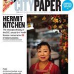
Maybe the publication got caught up in redesign mania and slacked off on content, particularly in the cover story about alternative places to get your prayer on. To regular readers, the rainbow-colored pages profiling 12 spiritual centers bares a striking resemblance to the weekly profile of area churches that’s been a appearing in the City Paper for years. In fact, many of the facts are pulled from the bygone days of summer 2006. Could it be that the staff simply thumbed through their file and pulled the more interesting tidbits?
The welcome introduction of The Onion to the District puts new pressure on existing free weeklies to step up their game. More choice is always better for readers, but can dilute the influence of established outlets. So nice try, City Paper, but new fonts and hues only take you so far. Let us know what you think of the redesign in comments.
Photo by Flickr user Scott Ableman