 Photo by sally henny penny.
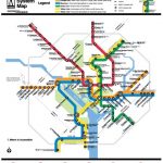
The Post’s Dana Hedgpeth provides us with this very interesting long read about Lance Wyman, the 73-year-old graphic designer who originally designed Metro’s iconic rail map and is taking on the challenge once again.
As Greater Greater Washington’s map makeover contest has proven, redesigning the Metro map for a new generation of rail riders certainly has its challenges, both concrete (how do you add in the Silver Line to Dulles and an upcoming split of the Blue Line without bunching everything together too much?) and more abstract — like how will Lyman maintain the integrity of his original design, all while keeping it as utilitarian as possible, addressing grievances like lengthy station names and ensuring that the map’s identity as a brand for the transit system doesn’t disappear?
Though Wyman is “reluctant to share his ideas for the new map,” Hedgepeth’s profile gives us some vague ideas of what the designer has in store for the revision, which should be released later this fall. Wyman wants to maintain the role of the monuments on the National Mall as a directional center (“They’re the nuclei of the whole map,” he says), and appears to be leaning toward a slightly minimalist reinterpretation. (“It’s always easier when you have less to put on,” he told Hedgepeth.) But if there’s one thing we don’t have to worry about at all, it’s the amount of effort Wyman is putting into the project:
Wyman has woken up in the middle of the night, fretting over aspects of the new design. What shade of silver should he use for the Dulles rail line — if it is officially named the Silver Line? How much space do you place between each station? Should station names be hyphenated or use slashes? And how do you fit all of the information and not crowd out the main icons, including the Capitol and the Washington Monument?
[…]
He knows there’s a chance for failure. … Wyman said he wants to make sure the Metro map is usable in every shape and form. The unfolded billfold pamphlet can’t be bigger than two $1 bills side by side. The map has to work on mobile devices and online, as well as in poster-size displays at Metro stations.
“The map has spirit,” he said. “It has to hang together like a good piece of music. It’s got life, a beat with colors and station stops. There’s a sense of rhythm. It has a solidity to it that’s unique to Washington. I don’t want to lose the good music.”
Sure sounds like Metro got the right man for the job, eh?