Martin Austermuhle
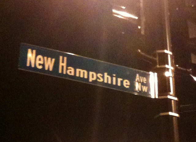
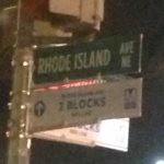
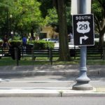
 Photo by squidpants
Yesterday DCist writer Andrew Wiseman noticed some pretty awful-looking new street signs going up around the Georgia Avenue Metro station. The picture he posted of the New Hampshire Avenue sign was particularly egregious — there’s three font sizes going on.
So, what’s gives? Well, as the Post revealed recently, the signs are new to the District. In following federal standards, the signs will use a new font and incorporate lower-case lettering, a significant change from our current all-caps street signs.
But still, that New Hampshire Avenue sign just doesn’t look right. And it isn’t, said D.C. Department of Transportation spokesman John Lisle in an email to us:
The manager of our Field Operations Division, which includes the Sign Shop, says the New Hampshire Ave, NW sign should not have been installed. It was one of the first prototype signs that we were testing with the new font, but somehow made it out into the field.
The issue that we were having at first when we started changing the sign over to the new font was that the District uses extruded street name sign blanks. Most jurisdictions throughout the United States apparently use regular flat plate street name signs blanks. They have no extruded edges and they are cheaper in cost.
The MUTCD and the Federal Highway Sign Standards and Specifications did not take into consideration street name blanks with extruded edges. So we had to work with the font size to fit on sign blanks with extruded edges.
We have worked through this problem and all the signs we are now installing meets the required standards and specifications as set forth.
Finally, the sign that was installed by mistake will be removed today and replaced with the correct sign.
That’s good news. (Then again, with the way the Granite State recently screwed us on statehood, maybe we should leave this one up.) Regardless, I’m of the opinion that the new mixed-case street signs just don’t look good. But how they look isn’t the point, it seems — studies seem to confirm that mixed-case lettering on signs like the ones we’re going to get is easier to see from further away, allowing drivers to prepare better for turns.