Martin Austermuhle
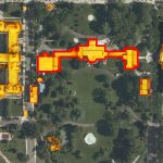
 If a picture is worth 1000 words, then an interactive map must be worth 10,000. Well, at least that’s the thinking in the mayor’s office.
Today D.C. Mayor Anthony Williams introduced a new way for residents to better envision how the city around them is changing — an interactive map highlighting accomplishments in 14 policy areas over the course of 2005, from economic development to employment to education. In a statement, Williams noted, “This interactive map provides District residents a tangible overview of the improvements we’ve made in their neighborhoods on a broad range of issues. The map does a great job of outlining the significant strides that we made together in 2005, both citywide and in individual communities. It also shows how we’re paving the way for continued success in the future.”
This is a cool idea, in step with a generation that needs to see everything in Google Map format or something similar. We ‘d like to see it updated to reflect some recent changes, though. After all, a huge “No Smoking” sign over the map of the District would look pretty snazzy.